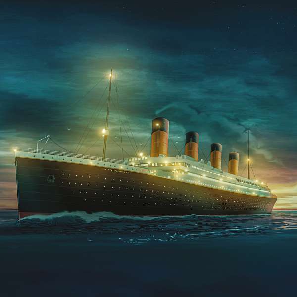
Open!Until 20 May
TITANIC: The Artifact Exhibition
Tour & Taxis, Brussels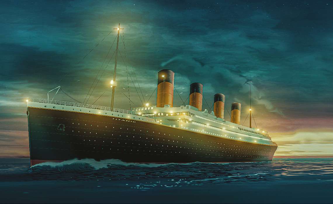
LAST TICKETS!27 & 28 avril 2024
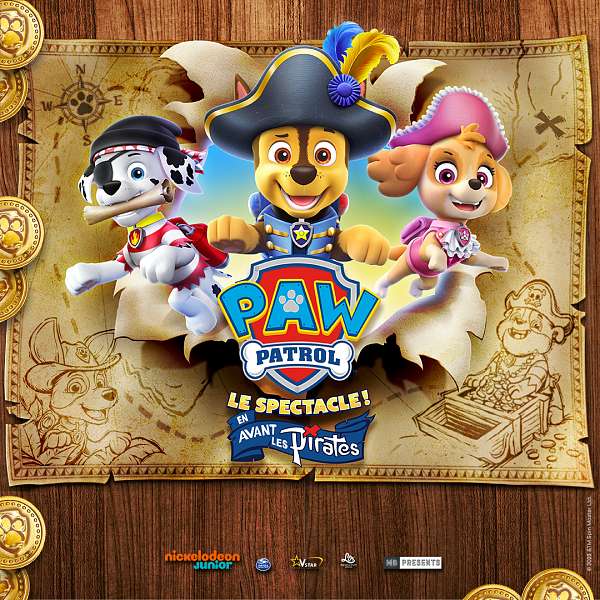
Pat’ Patrouille, le spectacle !
Ing Arena, Bruxelles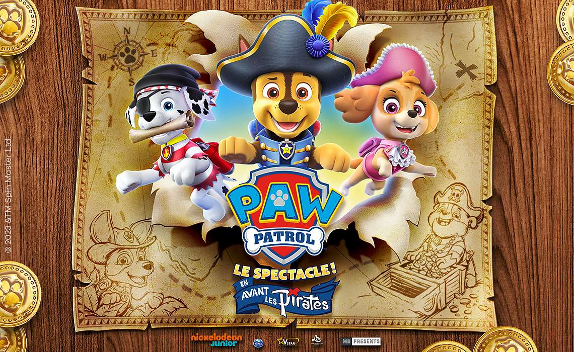
LAST TICKETS!4, 5, 9 & 10 MAY 2024
DIRTY DANCING IN CONCERT
ANTWERP, BRUSSELS, OOSTENDE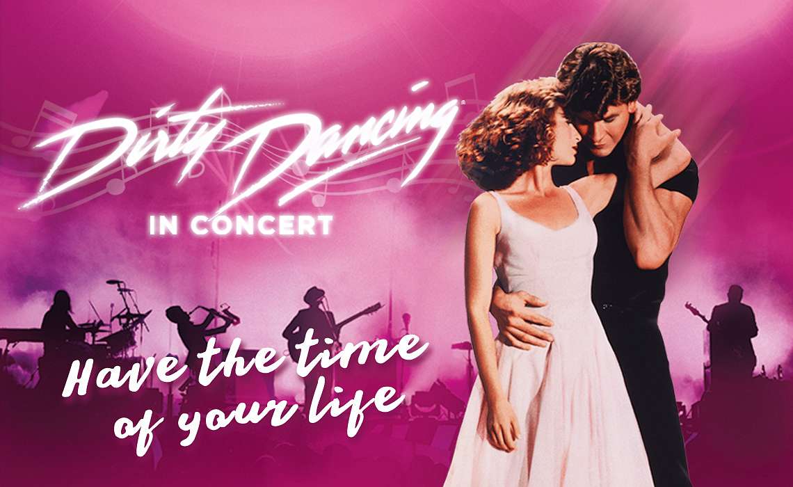
LAST TICKETS!9, 10, 11 & 12 MAY 2024
Brel! The Show
BRUSSELS, LIÈGE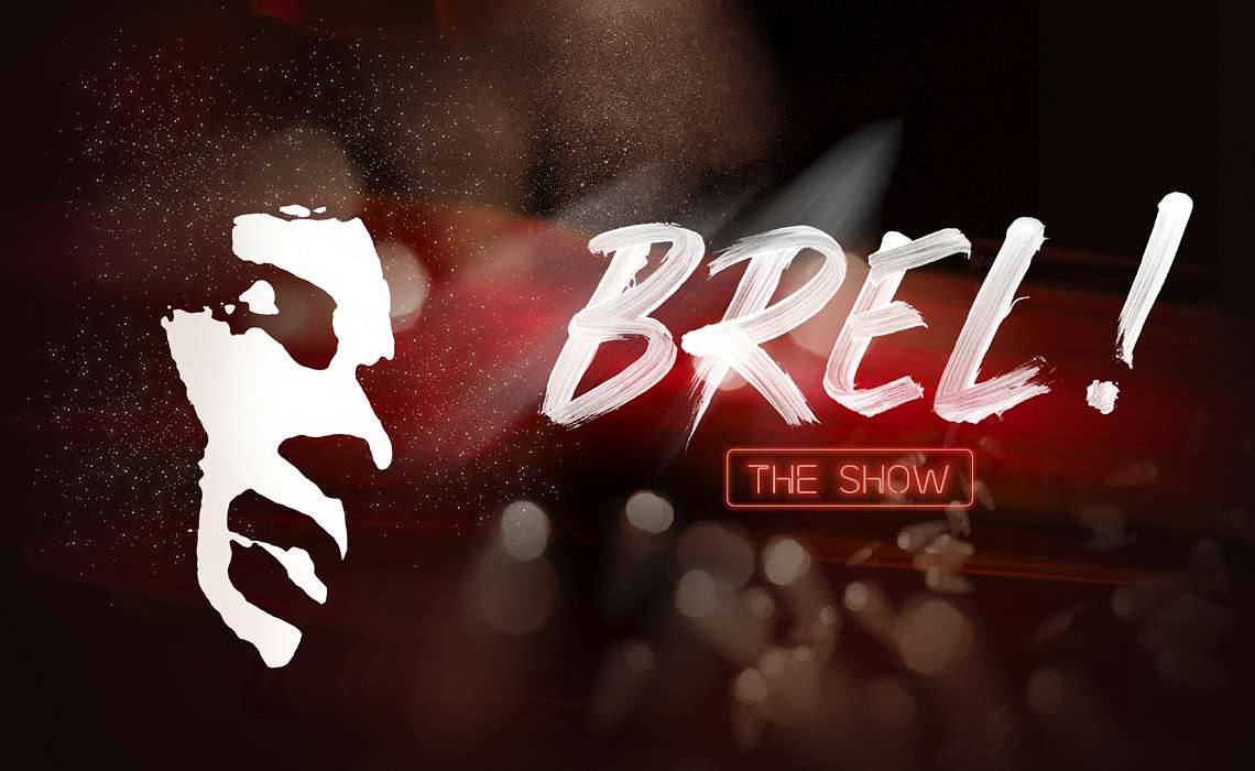
Last tickets!11 MAY 2024
The Ultimate Tribute to Michael Jackson
Cirque Royal, Brussels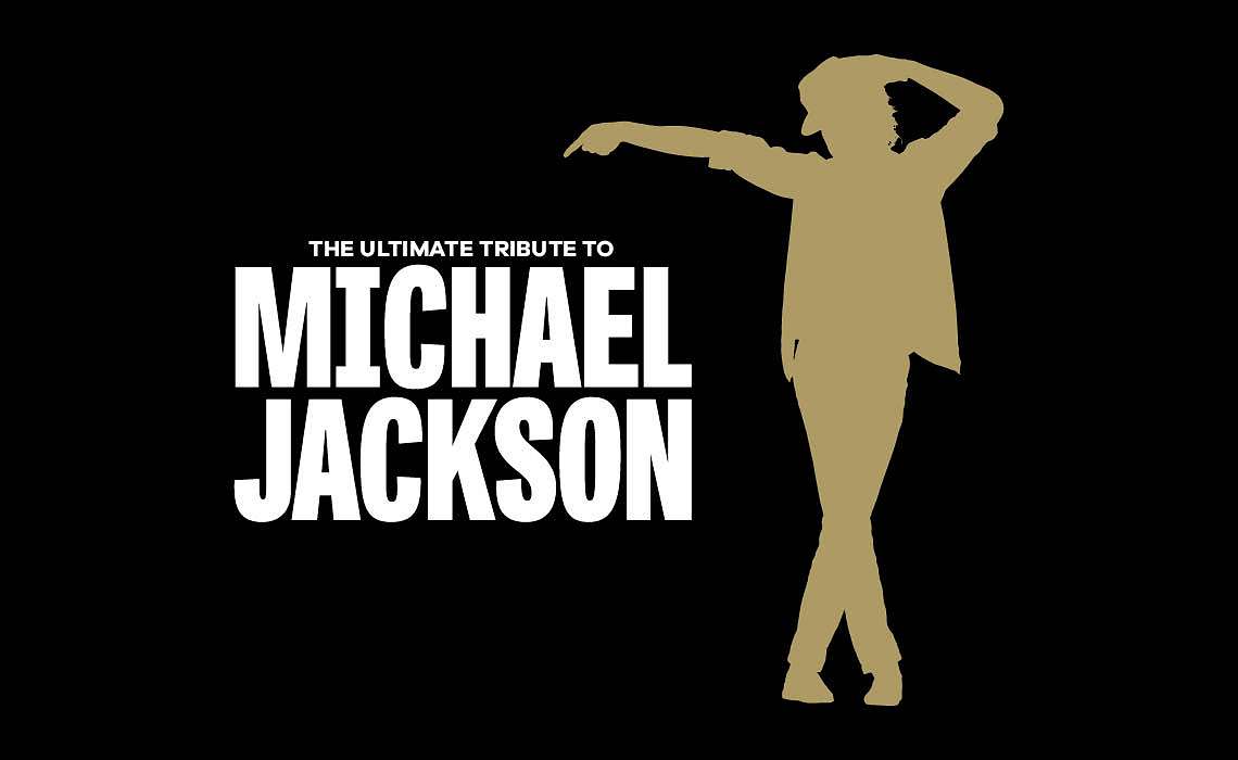
Last tickets!19,23 MAY & 21 NOV 2024
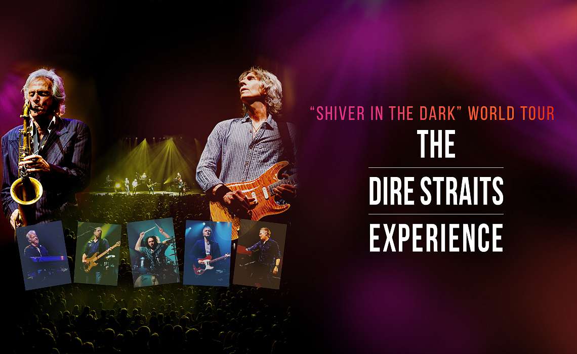
Dire Straits Experience
Bruges, Antwerp, Brussels